Sashes, stripes and hoops. Sacramento Republic’s history has had a coherent visual language when it comes to jerseys. Aside from one exception, the club’s kits in their run since starting play in 2014 have featured the same colors and variations of similar patterns.
Which kit is the best of the lot? That’s for you to decide. Here’s a look through the lewks of Sac Republic’s history, and at the end you need to vote for the winner. One quick note: Where I couldn’t find photos of various kits, I had to resort to screenshots to get some kind of likeness of the jersey.
2014-15 primary
Starting with a bang, the club went with a Lotto kit (perhaps the last pro team to wear that brand in the U.S.?) that featured a sash. Sashes are generally terrific and underused, and it’s a look that gives the jerseys an immediate recognition.
2014 secondary
Why mess with a good thing? The secondary jersey was also a sash, with a red sash on a white background. Boom, classic.
2015 third
This kit started going afield, with maple being the predominant color, and the jersey style switching to hoops. While Louisville City had a similar kit with a paler maple/gold color that looked awful, this one was different enough from skin tones to look decent, and it was a look the team returned to again.
2016-18 primary
Starting in 2016, the club switched to Nike for their kits (something that will change when they join MLS in 2022, when they’ll wear Adidas). This primary swapped out the iconic sash, but vertical stripes of the same color is a classic look and it’s no wonder the club stuck with it for so long.
2016-17 secondary
The secondary kit in these years was also vertical stripes, this one with clear color contrasts, with the central stripe a gradient.
2018-19 secondary
The hoops came back, with the secondary jersey basically flipping the orientation of the stripes to be horizontal.
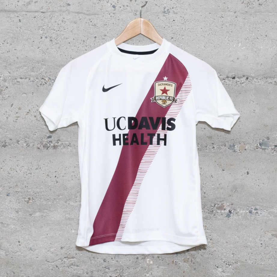
2019-present primary
Might be a bit hard to see this one, but the current primary jersey returns to the sash and retains the monochrome look with the design feature subtly showing up.
2019 third
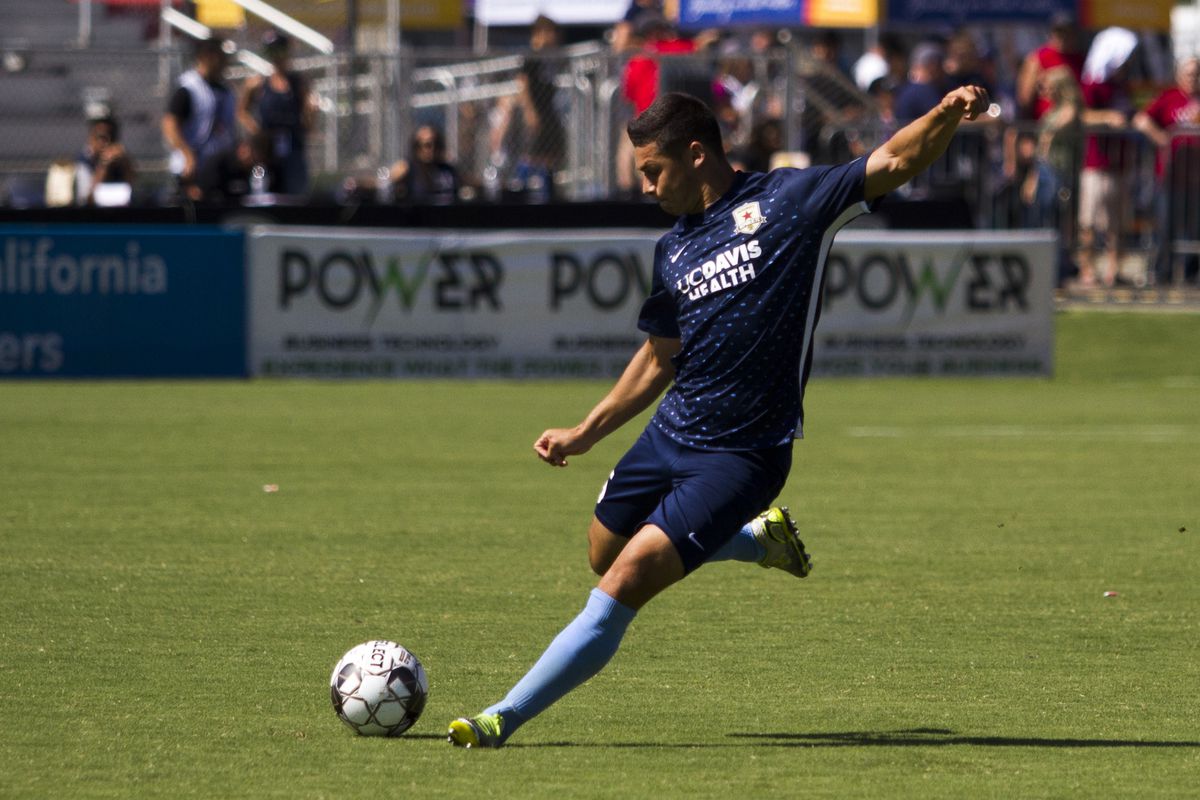
The most drastic change in club history, they used this third kit, that was the color blue and featured a polka dot pattern on the front, a few times.
2020- secondary
The sash is back for the secondary kit, and while the club hasn’t worn this one yet, they go back to the look from the first season, with a color-contrast sash. This one has a fringe pattern on the end of the solid color sash.
So that’s the lot: Which one is best in your opinion? Cast your vote and let us know why you picked the one you did in the comments below!
Poll
Which jersey is best in Sac Republic history?
This poll is closed
-
18%
2014-15 primary
(6 votes) -
6%
2014 secondary
(2 votes) -
12%
2015 third
(4 votes) -
15%
2016-18 primary
(5 votes) -
6%
2016-17 secondary
(2 votes) -
12%
2018-19 secondary
(4 votes) -
9%
2019-present primary
(3 votes) -
9%
2019 third
(3 votes) -
9%
2020- secondary
(3 votes)